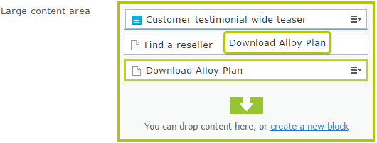
Our customer editors complained that they have problems with using drag and drop functionality of ContentArea. They quite often use Remote Desktop connection to access the edit mode. The placeholder for ContentArea dragged element is relatively small. With the combination of RDP display lags makes using this feature difficult.

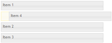
We decide to help them by increasing the drop area for ContentArea. We would like to achieve similar effect like in jQuery UI where size of drop placeholder is equals to regular item.

I didn’t want to write a lot of custom code and prepare a separated widget to represent the drop area. That’s why I tried to simply change the layout using CSS. The drop area is top and bottom borders of a regular item. I increased the size from 1px to 30px.
|
1 2 3 4 5 6 7 8 |
.Sleek .epi-tree-mngr .dojoDndItemBefore { border-top-width: 30px; } .Sleek .epi-tree-mngr .dojoDndItemAfter { border-bottom-width: 30px; } |
Then I included custom CSS in a global module.config file. We need to add path to a custom styles Styles/CustomEditMode.css.
|
1 2 3 4 5 6 7 8 9 10 11 12 13 14 15 16 17 |
<?xml version="1.0" encoding="utf-8"?> <module> <assemblies> <!-- This adds the Alloy template assembly to the "default module" --> <add assembly="ChildrenGridView" /> </assemblies> <clientResources> <add name="epi-cms.widgets.base" path="Styles/Styles.css" resourceType="Style"/> <add name="epi-cms.widgets.base" path="Styles/CustomEditMode.css" resourceType="Style"/> </clientResources> <dojo> <!-- Add a mapping from alloy to ~/ClientResources/Scripts to the dojo loader configuration --> <paths> <add name="alloy" path="Scripts" /> </paths> </dojo> </module> |
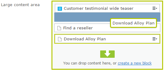
The result adding those two additional styles:

Now when editor is sorting or adding new items and he need to place it between two existing items, the drop placeholder should be better accessible.

