You haven’t seen much from me for a while, it’s because I was working on a bigger feature. Haven’t include much text or code snippets this time. Rather wanted to present overall functionality. Lot of images and animated gifs. Take a look on ChildrenGrid custom view. View displays a configurable list of children for current content.
Overview
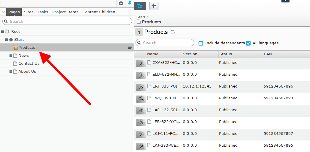
Main navigation tree is useful when child nodes are within the eye view. When content node contains more then for example 30 children it’s hard to locate an items.
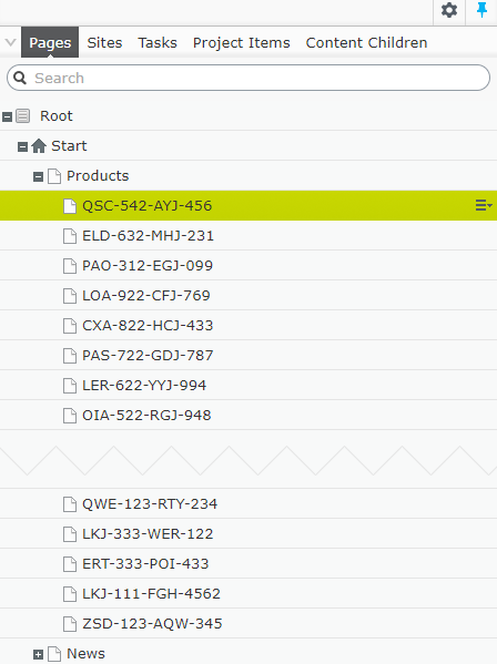
Using table view should also simplify displaying filtered results and allow to show more information about the content in the columns.
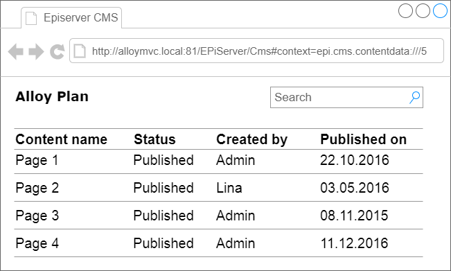
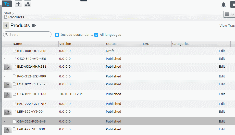
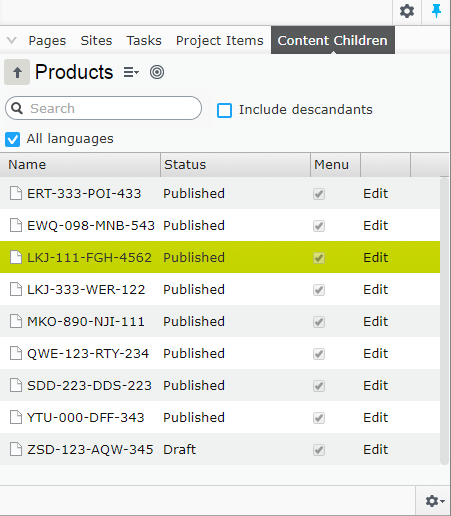
I started developing grid-based list of child pages. I added some simple filters, infinite scroll and common editing toolbar. The list is registered as new custom view available for every Content Type. Here is the overview:
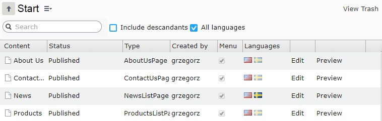
And here is how the navigation looks like:
Configuring columns
But what columns should be showed on the list? Probably editors with multilanguage sites would like to manage languages from the grid. For others, could be properties related with content publication like “Published By” and “Published On”. Also would be good to display properties specific to for the site like “Hero image” or “Short description”.
To help all editors I allow to configure the columns. You can show, both standard properties like “Name”, “Status”, “Include in menu” and any custom property added to the model.
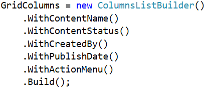
Columns are configured on the server side. To simplify configuration code I prepared a builder class. The sample columns configuration looks like:
Column renderers
The column is not just property value rendered as a text. I implemented a set of cell renderers for displaying images, content references or dates. For example the image renderer displays thumbnail. After editor clicks on the thumbnail the popover with higher resolution and link to the image are displayed.
The list of built-in renderers is quite long. It inclides renderers like:
- Name – with name of the content, content icon and language information (same as in navigation tree)
- Status – localized content status
- Type – localized content type name
- Languages – displays list of all site languages
- Dates – formatted date
- Content Link – with editable and previewable versions
Custom renderers
Developer can implement custom renderer. For example when ProductPage type has MajorVersion, MinorVersion, Relase Version, BuildVersion integer properties and we want to include this information on the grid.
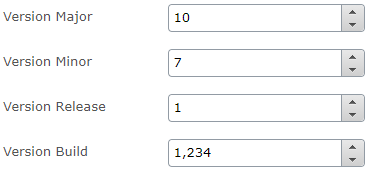
We probably would like to show it as one column with dot separated values. In this example it wil be “10.7.1.234”.
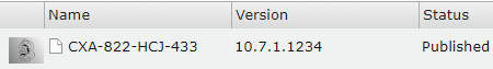
With custom renderer it will be display like:
Main menu
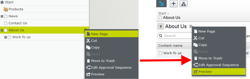
ChildrenGrid has context menu available next to current content name and in every row of children. Commands provider is shared between the View and main navigation. It means that view will display same actions as the tree. Even when you implement custom tree context menu action using the “epi-cms/plugin-area/navigation-tree” it will be showed in the view. For example I added “Preview” command that opens selected page in View Mode.
Working with languages
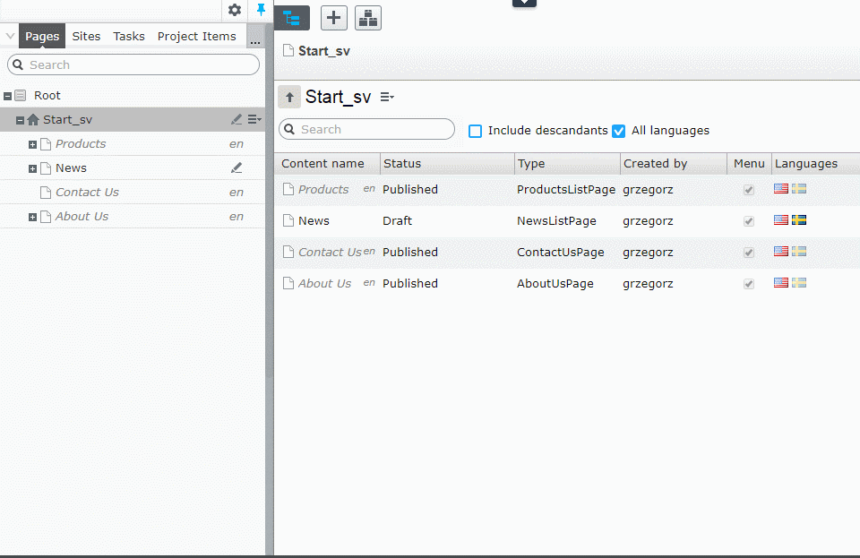
Working with languages in ChildrenGrid is similar to Navigation Tree. All translated versions and master versions for non-translated pages are displayed by default. When translation is missing, content name has italic font style.
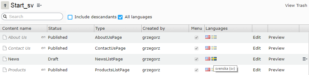
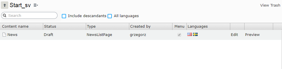
To show only translated pages you can uncheck “All languages” filter. It’s the same filter as “Show content in current language only” on the Navigation Tree.
ChildrenGrid has additional feature. There is a special column renderers for managing languages. For every cell it displays all languages available on the site. Missing translations are grayed out. Clicking on the flag will change the language context and page context.
Configuring view for page type
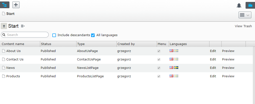
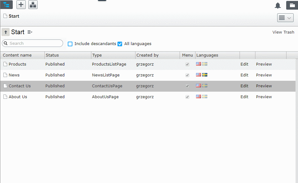
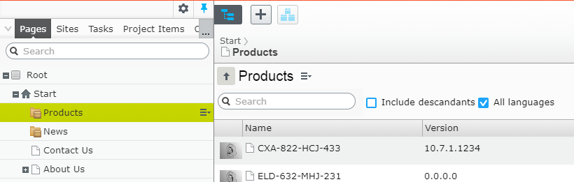
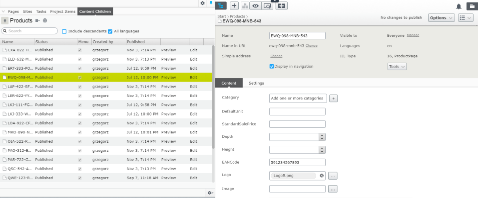
For ProductsListPage container, which can contains only ProductPage types, we would like to show different columns, that for other pages in the system. It doable using ChildrenGrid, because columns are configured through the extended UIDescriptor (ExtendedUIDescriptor). For example there are two UIDescriptors, one for SitePageData (the base class for all pages in the solution) and one for ProductsListPages container type.
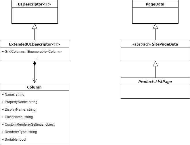
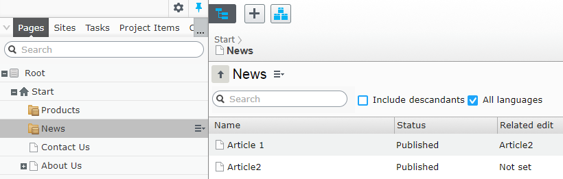
For SitePageData we show general information:
 ”
”
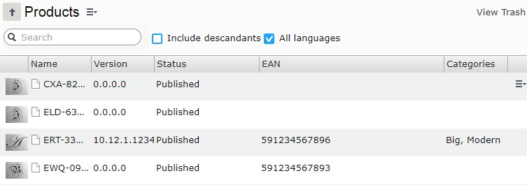
But for Products we show thumbnail, version and and categories:
Navigation tree with locked nodes
For nodes with large number of children expanding child nodes can be turned off. Those nodes will be showed with a different icon.
It can be done through web.config where I added ContentContainers setting. Setting stores coma separated list of ContentReferences that should be displayed as Container pages and have no expand button.
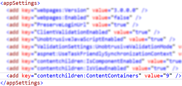
The Administrators can turn on and off nodes directly through the Edit Mode using “Manage Containers” button  . Of course without ContentReferences added through web.config which are disabled globally. For them it’s not possible to turn off containers through the UI.
For other pages, command is enabled.
It’s a toggle button. When page is not a container, after clicking the button, it will become a container. When page was a container, after clicking the button, page won’t be a container anymore.
Children View as MainNavigation Component
Custom view give the overview of the children, but it could be useful to locate the content and using D&D add it to the ContentArea. For this reason ChildrenGrid can be registered in the navigation pane.
Columns are also configurable, so you can extend the pane to have more information about the content.
You can use search to filter the list and D&D items to ContentReference properties.
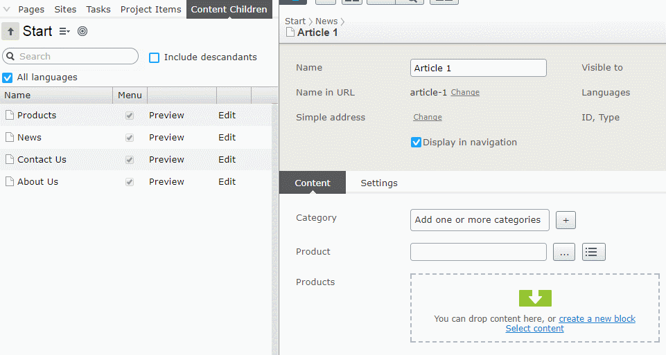
You can also edit the page, filter the list and get back to edited page context.
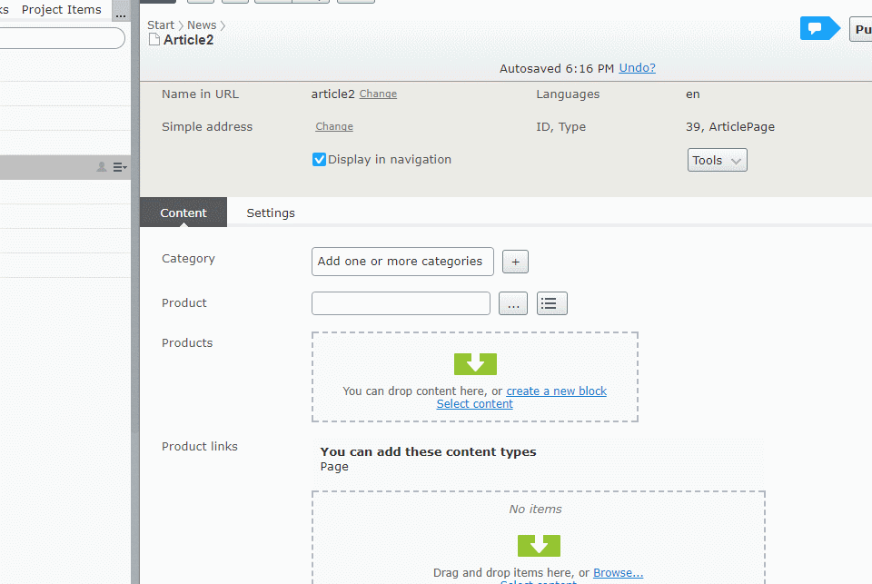
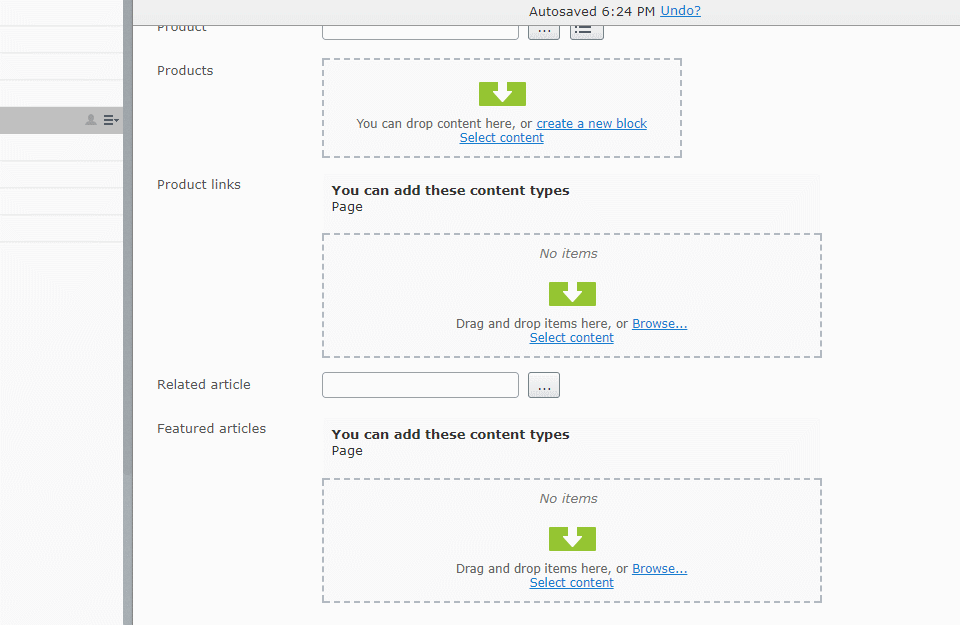
ChildrenGrid in link properties
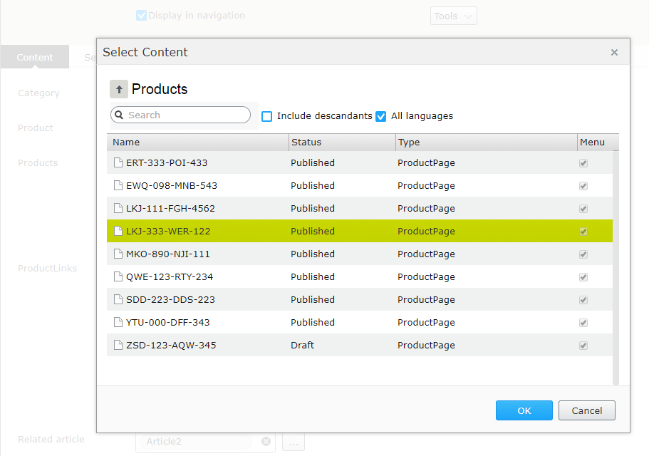
Selecting content using “Select content” dialog is quite hard when container has more than 30 items.
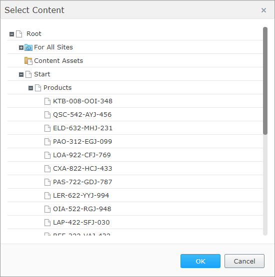
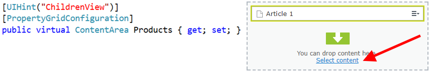
I prepared extended versions for ContentReference, ContentArea and ContentReference list properties. They can be used by adding “ChildrenView” UIHint:
- ContentReference

- ContentArea
- ContentReference list
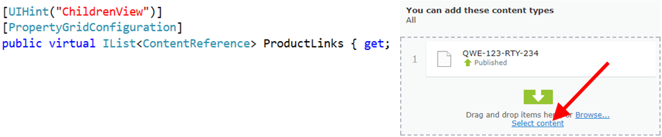
- Properties have additional button for selecting content using ChildrenGrid. Clicking the button will show the dialog with ChildrenGrid.
Of course there is a support for “Allowed types” and multiselect to ContentArea and ContentReference list.
Below is a demo of adding item to ContentReference property: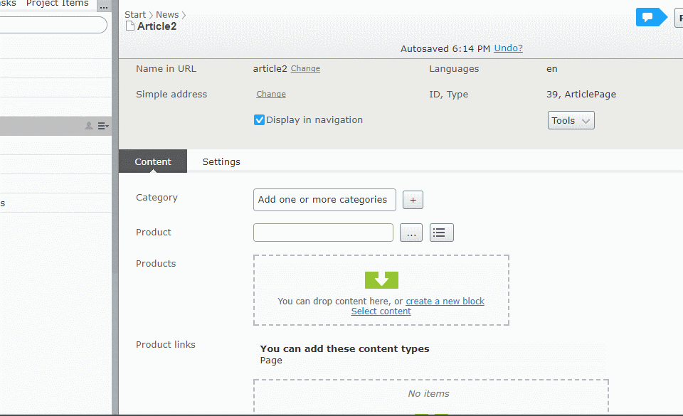
and demo of adding items to ContentArea:
You can define starting point for properties. For example for “Featured Articles” we would like to show the dialog with “News” container while for “Product links” property from the “Products” container.
As you can see ChildrenGrid can be used in various scenarios, as a custom view, navigation component and in the link properties. It has columns configurable per page type and allow to customize renderers in many ways. There is also support for filtering and managing languages.