By default Episerver use dijit checkbox when rendering boolean property. I wanted to add a possibility of defining labels for true and false values. That’s why I prepared a switch button property that displays configurable label for the selection. It can be useful to highlight the selected value.
Using switch button property
To use new editor simply add “Switch” UIHint on boolean property in the model (or use SwitchEditorDescriptor.UIHint const).
|
1 2 |
[UIHint(SwitchEditorDescriptor.UIHint)] public virtual bool UseCustomLayout { get; set; } |
New editor has few configurable settings. I added new custom SwitchSettings attribute that allows to set label, shape, description and background color of switch. Those settings are not required.
Custom labels
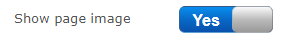
Labels representing True and False values can be changed. Defaults are ON for true and OFF for false. Labels are useful to describe the selection. For example for “Use custom layout” boolean property it can be “Default layout” for False and “Custom layout” for True. For other properties it can be “Show/Hide”, “Yes/No”, “Started/Stopped” etc.
To set labels you can use TrueText and FalseText properties. Unfortunately switch doesn’t calculate width automatically. For long labels it has to be set manually using Width property.
|
1 2 3 |
[UIHint(SwitchEditorDescriptor.UIHint)] [SwitchSettings(TrueText = "Custom ON", FalseText = "Custom OFF", Width = "180px")] public virtual bool UseCustomLayout { get; set; } |
Custom shapes
Dojox.switch has few predefined shapes. I allowed to select one of them when displaying the editor:
- Arc
- Arc2
- Round
- Round2
- Square
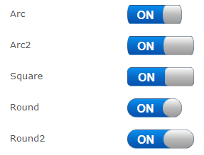
To change the shape use Shape property. Predefined shape constants can be found in “Shapes” class.
|
1 2 3 |
[UIHint(SwitchEditorDescriptor.UIHint)] [SwitchSettings(Shape = Shapes.Square)] public virtual bool UsecustomLayout { get; set; } |
Custom colors
You can also change background color for True and False labels. I preapred few predefined clases based on deafult Episerver colors style guide. Editor can see warning or success color when selecting value.
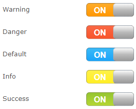
To set colors classes you can use TrueStateClass and FalseStateClass attributes. Predefined classes constants can be found in “StateClasses” class.
|
1 2 3 |
[UIHint(SwitchEditorDescriptor.UIHint)] [SwitchSettings(TrueStateClass = StateClasses.Info, FalseStateClass = StateClasses.Primary)] public virtual bool UseCustomLayout { get; set; } |
Custom selection description
Both True and False value can have description displayed next to the editor. It can be useful for Editor to explain selection value. For example, if Editor decided to use “Custom Layout” instead of “Default layout” he should be aware that to make site working properly he needs to configure additional system settings. The description can be used together with label color, so when switch is ON he will see warning label and the information text.
To change the description you should use TrueDescriptionText or FalseDescriptionText properties.
|
1 2 3 |
[UIHint(SwitchEditorDescriptor.UIHint)] [SwitchSettings(TrueDescriptionText = "Description for ON", FalseDescriptionText = "Description for OFF")] public virtual bool UseCustomLayout { get; set; } |
Implementation
To create an editor I used dojox/mobile/switch widget. Now I’m not sure if that was the best choice. The “dojox/mobile” is not available in EPiServer, so I had to add this part of Dojo library manually. Also library doesn’t support updating some values (like shape). I think that simple CSS based switch could have modern look and be easier to customize.
The code is avialable on Github